Browse 404 Page Examples
Real error pages from top brands — filter by style, industry, or platform.

A retro Nokia phone 404 page with a fully playable Snake game. Eat, grow, and try not to crash game over screen included. Free to download.

A sci-fi 404 page with a tractor-beam UFO abducting scattered "404" fragments. Drag to orbit the scene. Fully customizable, ready to download.

A nostalgic Os-style 404 page template with stacked fake error dialogs and the classic Bliss wallpaper. Fully customizable, ready to download.
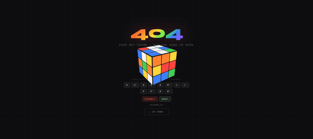
An interactive 404 page with a draggable Rubik's Cube you can scramble and solve. Playful and tactile. Fully customizable, ready to download.
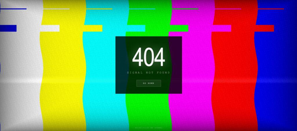
A retro TV 404 page with color-bar static, scanlines, and a glitching "No Signal" screen. Nostalgic broadcast style. Fully customizable, ready to download.
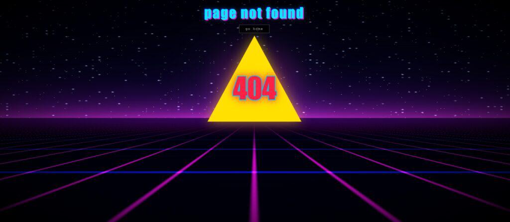
A noir-style 404 page with a redacted "Classified" stamp and glitchy scanline effects. Moody, cinematic design. Fully customizable, ready to download.
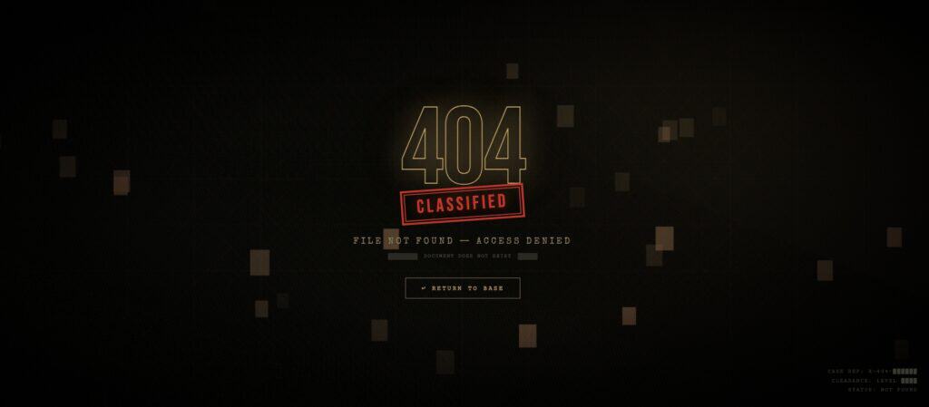
A noir-style 404 page with a redacted "Classified" stamp and glitchy scanline effects. Moody, cinematic design. Fully customizable, ready to download.

A sci-fi 404 page with a glowing dimensional portal and swirling galaxy background. Bold, immersive design. Fully customizable, ready to download.

A minimal 404 page with a draggable, spinning Earth globe between the "4"s. Clean editorial style. Fully customizable, ready to download.

An underwater 404 page with a drifting weather-reactive globe and glowing "4"s. Calm, immersive design. Fully customizable, ready to download.

A hypnotic 404 page with a blue vortex spiraling around bold, glowing text. Bold and mesmerizing. Fully customizable, ready to download.

A playful 404 page with a floating field of emoji drifting across the screen. Fun, colorful, and lighthearted. Fully customizable, ready to download.

A 3D chess board 404 page with sculpted pieces on a moody perspective board. Fully customizable, ready to download.

A pharma-themed 404 page with falling capsules and tablets tumbling across the screen. Vibrant, medical-inspired design. Ready to download.

A honeycomb-themed 404 page with an animated WebGL hex grid and buzzing bees. Playful, hand-drawn detail. Fully customizable, ready to download.

Bright, illustrated and unmistakably Canva a playful error page that turns a dead end into a moment of delight.

A polished, on-brand 404 page with clear navigation. HubSpot turns a broken link into a smooth recovery experience.

Playful illustrated mascots and Discord's signature tone turn this 404 page into a moment that still feels like home.

The business paper turns a missing page into an economics lecture: "why wasn't this page found?" answered by twenty-odd theories — liquidity traps, moral hazard, the tragedy of the commons — each one a deadpan gag.

The chess platform answers a missing page with a looping GIF: a guy in a giant green pawn suit who magically vanishes — the disappearing act standing in for the page that's gone.
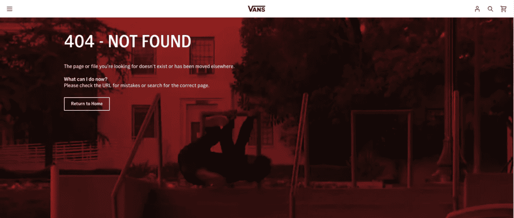
The skate brand sets its plain "404 - Not Found" over a red-washed montage of skaters bailing and falling — the wipeout doing the joke, with a clear path home below.

The toy maker keeps its 404 unmistakably LEGO — a recognisable character and a light joke — while still giving a clear path home, so the brand survives the dead end.

The meme platform answers a broken link with what it does best: an endless scroll of memes where the error message should be, so a dead end becomes a time sink.

Vidéotron frames its 404 as a smashed fortune cookie that "predicted" the error — a bilingual joke that turns a dead end into a shrug.
Every entry in this gallery is hand-picked for its design quality, creativity, or clever use of the 404 moment. We look for 404 page examples that turn a dead end into a memorable experience — whether through illustration, humour, animation, or sharp copywriting. Updated weekly. Want to build one? See our 404 page design guide.